

Has it ever occurred to you that it's not just what you say, but also how you say it? Well, it turns out that the same rule applies to the written word.
The visual arrangement of your words – in other words, typography – can entice your audience to read more, engage more, and remember more.
And I know what you're thinking. "Typography, really? That's what's going to make people want to read more?" But trust me, it can truly be a game-changer.
Let's dive into six ways you can use typography to turn your text from a simple string of words into an irresistible treat for the reader's eyes.
1. The Art of Line Height
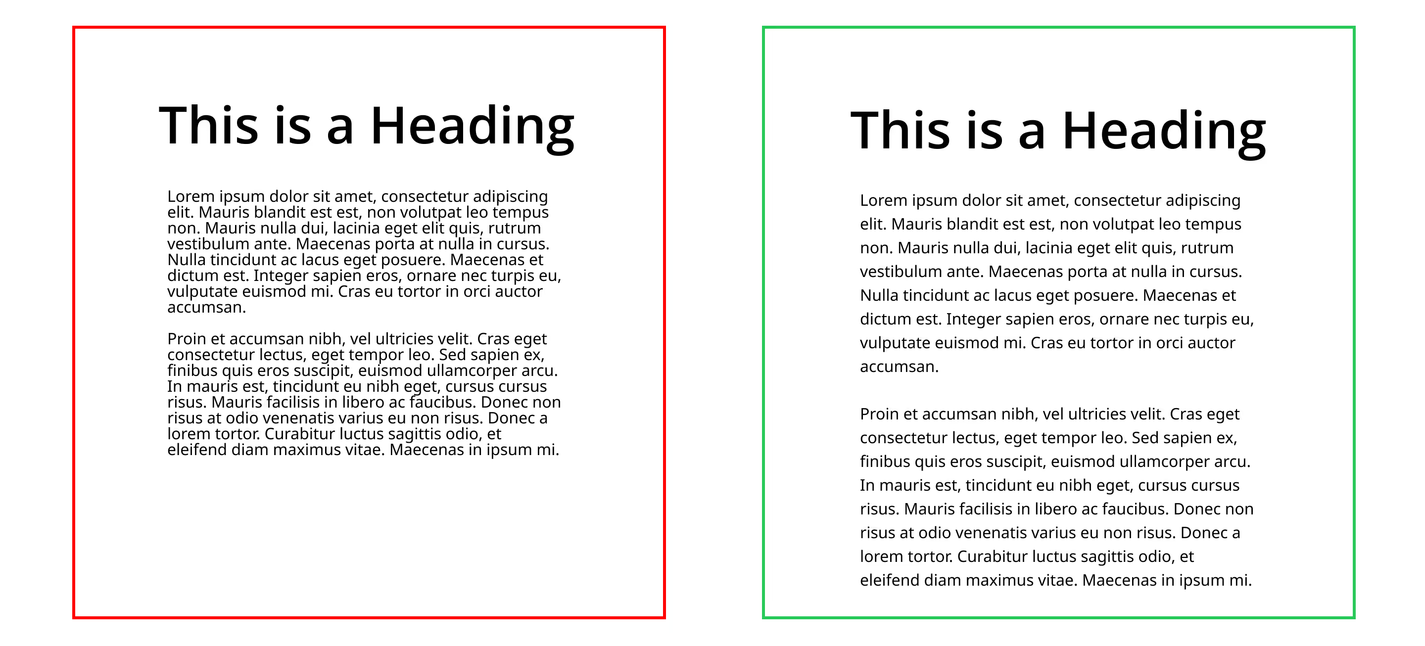
Do you recall a time when you were reading a book or an article, and your eyes got all muddled up, leaping from line to line like a confused rabbit?
Well, my friends, that's why line height matters. It's like a breath of fresh air between each line.
If the line height is too small or too large, it's going to be uncomfortable. But, when it's just right (1.1 to 1.3 times the text size for headings, and 1.3 to 1.5 times for body text), reading becomes a breeze.
2. The Subtlety of Letter Spacing
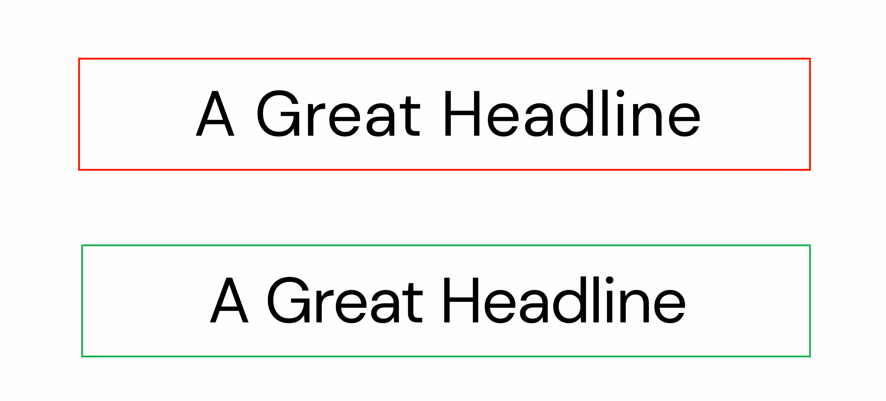
Letter spacing is the secret sauce in the hamburger of typography. Get it right, and your text will be tasty and easy to digest. Get it wrong, and you could end up with a mouthful of... well, confusion.
Negative letter spacing - that's a little less space between characters than usual - can give your headings a special touch of class. But be wary - use it on body text and your readers might need a magnifying glass!
3. The 'Align' of Duty
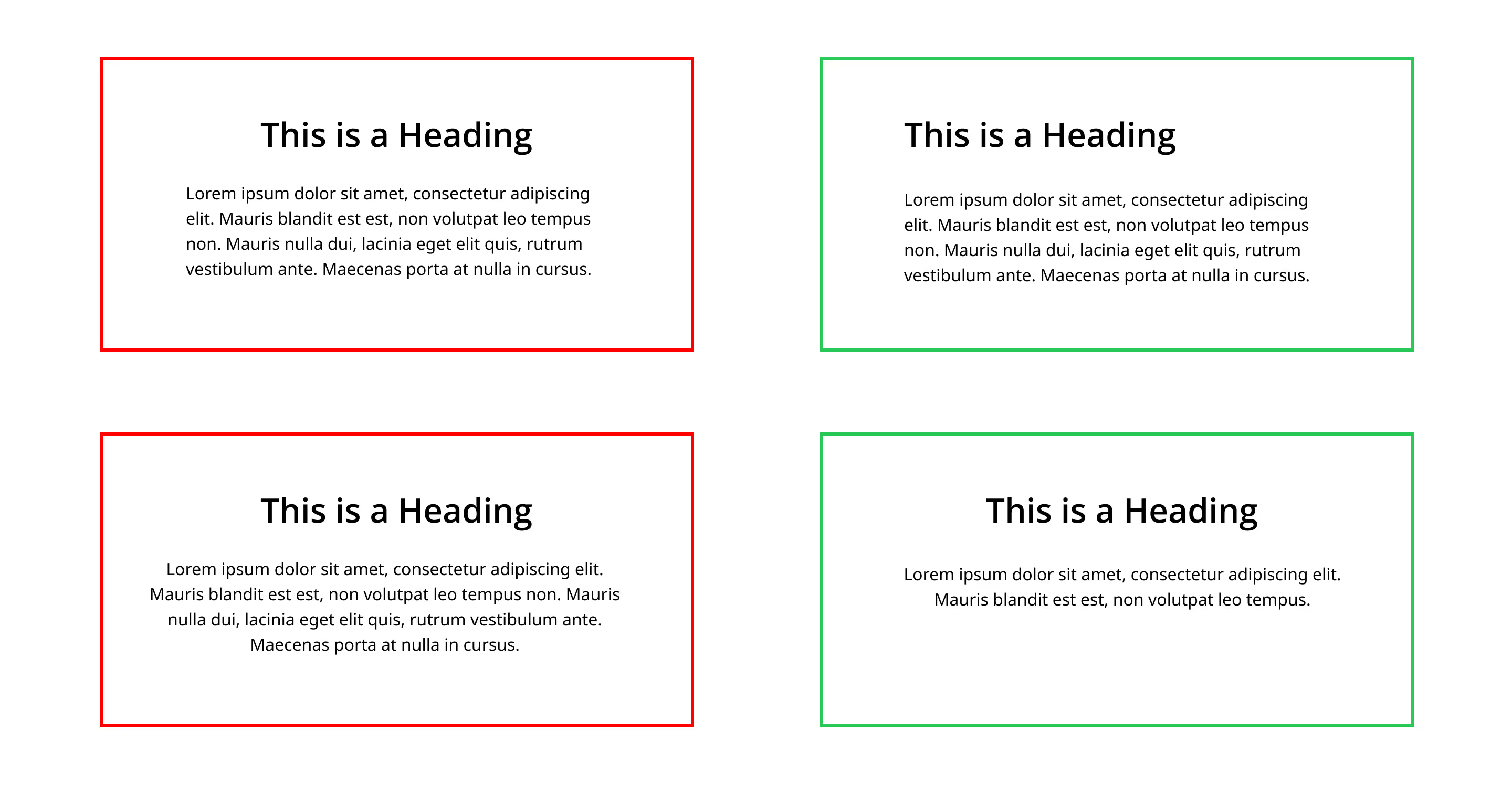
Text alignment is the unsung hero of typography. You might think center-aligning your paragraphs gives off a balanced, Zen-like vibe. But in reality, it can be exhausting to read if it's more than three lines.
For text that's more than three lines, left alignment is your friend. It's simple, clean, and won't make your readers' eyes zig-zag like a pinball machine.
And for the love of all things good on this earth, never ever use a center-aligned heading followed by left-aligned text. Ever.
Both the heading and the paragraph need the same alignment.
4. Size Does Matter - In Text Width
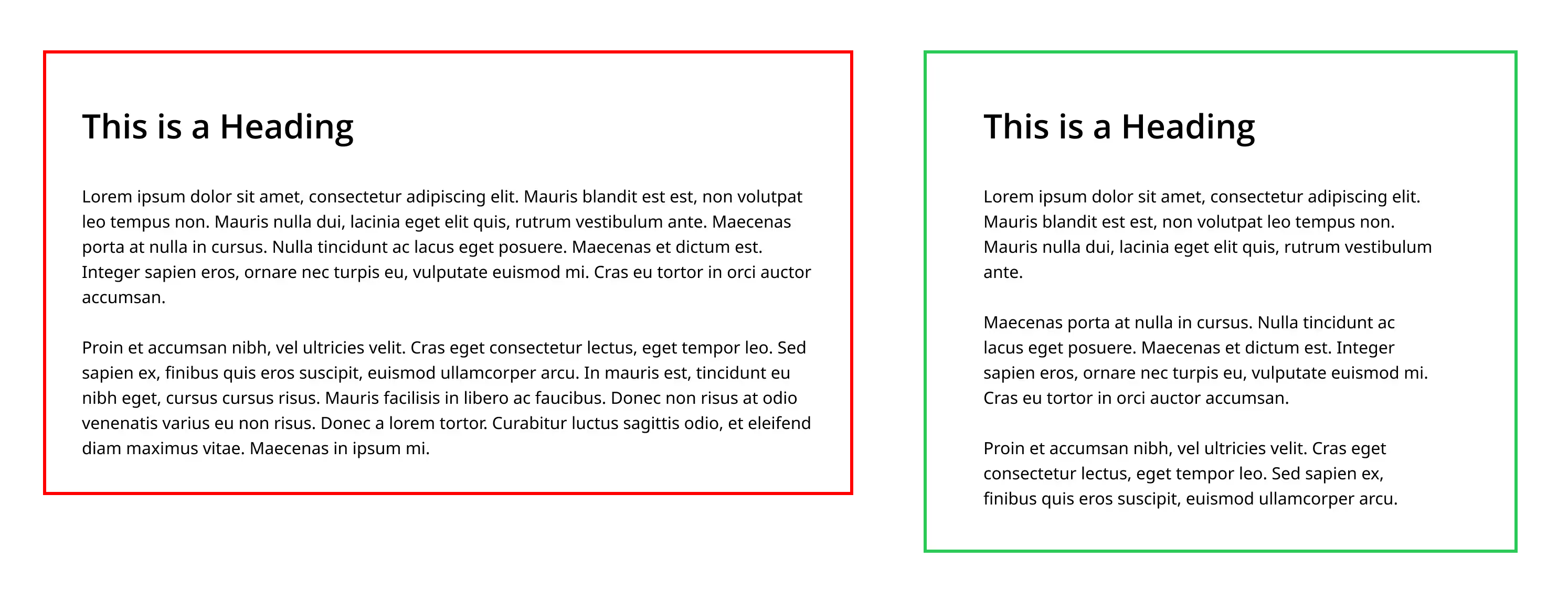
We've all been there - squinting at a page where the text stretches from here to Timbuktu. It's about as appealing as a marathon on a hot day.
That's why text width matters. The Baymard Institute recommends a range of 50 to 75 characters for body text. That's roughly 600 pixels wide on a desktop screen. Any longer, and you're venturing into 'too-long-didn't-read' territory.
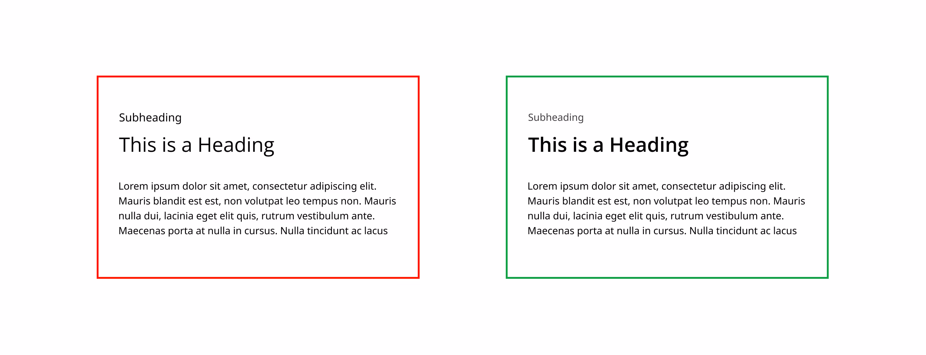
5. The Hierarchy of Text
I mean, we're not feudal lords, but in typography, hierarchy is key. It lets the reader know which information is the most important.
When it comes to indicating hierarchy, overdoing it with text sizes is like screaming at someone with a megaphone. It's just not necessary, guys.
Stick to two different font sizes, and let changes in font weight and colour do the talking. That way, your readers won't feel like they've accidentally walked into a circus.
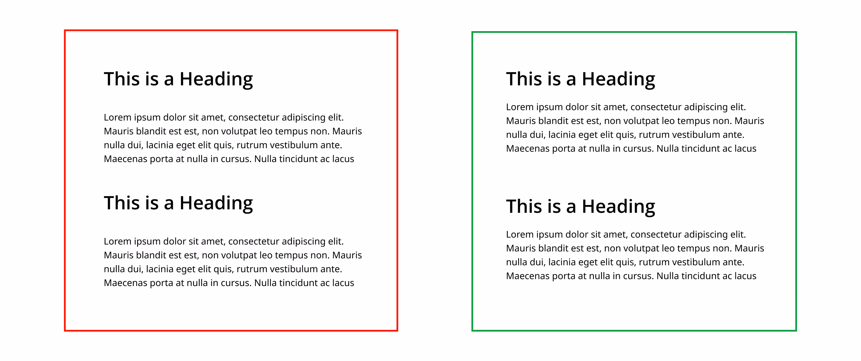
6. Spacing: The Final Frontier
How closely should you place your words? Well, consider the space between your text elements as the reflection of their relationship. Just like we stand closer to someone we're familiar with, elements that belong together should be closer too.
For example, the space between your heading and its paragraph is smaller than the space between that paragraph and the next heading.
Consistency is key. So, use the same spacing rules throughout. If your headings and paragraphs are separated by 16 pixels, then be consistent with that rule.
There you have it! Six typography tips that'll have your readers hanging on your every word.
Remember, typography is more than just pretty fonts. It's about creating an experience that makes your readers feel comfortable, engaged, and eager to read on.